making a paint decision
I let Amy take her pick on the Scamp, but I've been up against the wall with my Charger at times.
I think color is an acquired taste. I had this issue with my '68 Charger, when I first got it.
Initially, I saw a picture of a DD-1 pale metallic blue with the black top and interior, which is a little lighter than B3. the UU-1 blue is about like B3 blue from '69 up, but the DD-1 almost looks silver, only with a touch of sky blue in it.
I was stuck on this idea for a long time, because I loved what the silver did to the body lines on the car, only I liked that the blue made the stainless, chrome and other silver parts on the car, like the grille surround and face of the spokes, stand out from it.
After seeing how menacing black looked on the car, I considered that as well for about a year or so, but decided that it made the lines of that particular car sort of go away in a sense and it didn't have the simplicity of an A body to silhouette, so I threw that idea out the window for that car as well.
The car is LL-1 Bright Turquoise metallic, with a really terrible oxidized red Earl Scheib job on it, where I can see spots from the red coming off, so I could see the color. When I got the car, I wasn't that big into the color, because I didn't really have a good example of the color to see and I thought it looked tacky. It did look tacky and does, with the ugly red covering most of it, right now, so I realize why it took me a while to come around to it.
Later on, as I've had the car and more examples online and in person of the LL-1 color became available for me to actually look at, I realized how vibrant/ how much chroma it had and I fell in love with bright colors.
Lately, whenever I do a painting of something, I've been using brighter alternative color pallettes, rather than natural ones and I'm absolutely loving the results.
The way I think about color, now, is that it is there to set a mood. I did a picture of the villans from Bullitt in neons to mix the skin tones, background colors, etc. and it gave the painting a lot more appeal than just looking at a photograph.
Sometimes, changing the color of the car can enhance aspects of its impression that it gives off.
When you think about how these cars are designed, you quickly gather how there are groups of ideas that were combined to get the final result. The grille design, the sides, the interior, trim, etc... The same goes for color. A lot of the cars from the 1950s had tri-tones that combined colors like light blue, teal and greens, or even yellows.
So, sometimes, the dominating interest factor of a car doesn't need to be enhanced. Sometimes, its a good idea to think about some of the forgotten advertising goals of your car, why people loved them when they were new, compared to now and what kind of impression you get from your car and what you'd like to give others.
In the case of my '68 Charger, today, the dominant interest in the public would be its bad-guy legacy. A lot of people want intimidation from american cars from that era, but have forgotten about their practical and other social applications. The Charger was a high optioned, high trim specialty car, for someone looking for a luxury sports car. A pretty far cry from something that is constantly seen airborne on screen.
So I wanted to bring the car back to its social class with my paint choice and highlight its high trim level and higher tier, so I decided to chose from the '68 paint line and after seeing a few cars with the LL-1, it gave me the impression I was going for, with that car.

The Scamp is FJ6 green and we've decided to change the top from black to white, for many of the same reasons I decided to go with the turquoise on the Charger.
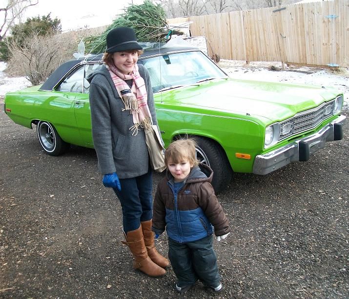

The white gives it a bright/ fun look, rather than bright and black, like the stripes on a wasp or caution tape, for intimidation.
Anyway, its up to you, but I would recommend thinking about what kind of impression you want the car to give off, to help with your decision.
Dave
I let Amy take her pick on the Scamp, but I've been up against the wall with my Charger at times.
I think color is an acquired taste. I had this issue with my '68 Charger, when I first got it.
Initially, I saw a picture of a DD-1 pale metallic blue with the black top and interior, which is a little lighter than B3. the UU-1 blue is about like B3 blue from '69 up, but the DD-1 almost looks silver, only with a touch of sky blue in it.
I was stuck on this idea for a long time, because I loved what the silver did to the body lines on the car, only I liked that the blue made the stainless, chrome and other silver parts on the car, like the grille surround and face of the spokes, stand out from it.
After seeing how menacing black looked on the car, I considered that as well for about a year or so, but decided that it made the lines of that particular car sort of go away in a sense and it didn't have the simplicity of an A body to silhouette, so I threw that idea out the window for that car as well.
The car is LL-1 Bright Turquoise metallic, with a really terrible oxidized red Earl Scheib job on it, where I can see spots from the red coming off, so I could see the color. When I got the car, I wasn't that big into the color, because I didn't really have a good example of the color to see and I thought it looked tacky. It did look tacky and does, with the ugly red covering most of it, right now, so I realize why it took me a while to come around to it.
Later on, as I've had the car and more examples online and in person of the LL-1 color became available for me to actually look at, I realized how vibrant/ how much chroma it had and I fell in love with bright colors.
Lately, whenever I do a painting of something, I've been using brighter alternative color pallettes, rather than natural ones and I'm absolutely loving the results.
The way I think about color, now, is that it is there to set a mood. I did a picture of the villans from Bullitt in neons to mix the skin tones, background colors, etc. and it gave the painting a lot more appeal than just looking at a photograph.
Sometimes, changing the color of the car can enhance aspects of its impression that it gives off.
When you think about how these cars are designed, you quickly gather how there are groups of ideas that were combined to get the final result. The grille design, the sides, the interior, trim, etc... The same goes for color. A lot of the cars from the 1950s had tri-tones that combined colors like light blue, teal and greens, or even yellows.
So, sometimes, the dominating interest factor of a car doesn't need to be enhanced. Sometimes, its a good idea to think about some of the forgotten advertising goals of your car, why people loved them when they were new, compared to now and what kind of impression you get from your car and what you'd like to give others.
In the case of my '68 Charger, today, the dominant interest in the public would be its bad-guy legacy. A lot of people want intimidation from american cars from that era, but have forgotten about their practical and other social applications. The Charger was a high optioned, high trim specialty car, for someone looking for a luxury sports car. A pretty far cry from something that is constantly seen airborne on screen.
So I wanted to bring the car back to its social class with my paint choice and highlight its high trim level and higher tier, so I decided to chose from the '68 paint line and after seeing a few cars with the LL-1, it gave me the impression I was going for, with that car.
The Scamp is FJ6 green and we've decided to change the top from black to white, for many of the same reasons I decided to go with the turquoise on the Charger.
The white gives it a bright/ fun look, rather than bright and black, like the stripes on a wasp or caution tape, for intimidation.
Anyway, its up to you, but I would recommend thinking about what kind of impression you want the car to give off, to help with your decision.
Dave