Very first try at this ... whaddya think?

-
The last two picture make it show up better.
I like your idea. With a little more practice on the color transition. Which I'm sure is a lot harder wiyh powder than paint.
You'll certainly have a winner.
Good luck!:thumblef:
 
Robert, most of them are lucky to get one color right. :-D


I will admit my own experience with powdercoating is limited. We've had one in the area who did custom powdercoating. He was good at it, but, unfortunately, had to close shop because he lost the use of both of his hands.

But I get what you're saying. Powdercoating around here is done on the industrial level with several plants in the area using it. Definately a different creature when you're doing it for fire hydrants. I can see where some folks who have done it on the industrial level might have a hard time making the transition into the custom automotive industry.
 
Nice work!! I think you're on to something there. Make it a Dodge or Mopar sign and I'd be in for one.

Bill


This Plymouth sign was one of several offered for sale for $21 by RPM over the last couple months, including "Mopar," "Dodge," "Dodge Dart / Drive" and "Demon." I know his current thread on the Mopar "M" signs is still alive so you should be able to grab one of those if you're inclined. (He's shipped five of them to me direct to save you guys money too -- Scott's a great guy to work with.)

I'm sure if there's enough interest, Scott's buddy could probably be talked into doing some more of the earlier runs. I know I'd be happy to coat more of them however you like. (If they arrive by May 31, they'll also qualify for this month's 15% off Anniversary Special.)
 
Wow Leanna, You are onto something.......very cool. Color combinations are endless as well as the fade transitioning. I've never seen it done before and think you are showing another artistic edge to your powder coating skills.

I can't wait to see the flame one you're doing for motopsycho 8).
 
I think overall it looks good, but my personal opinion is that the purple color from the two powders just doesn't jump purple, a little too muddy. I think with a different color combination, the blending would look great though.. Very, very cool idea.

Grant
 
Can you have copies made of that sign? I'd love one in Alien Silver and Turquoise!

No...No..... I NEED one in Alien Silver and Turquoise!!!!


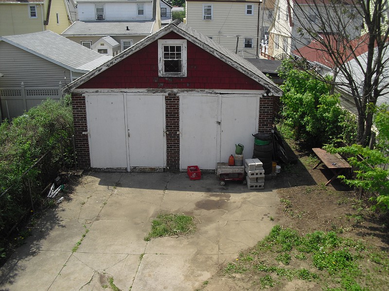
It'll look great hanging between the doors.... once everything is painted and landscaped!
HellYeah_House049-vi.jpg

<Shhhhhhhs !!> The Barracuda is sleeping in the left bay.....
:-D
 
Hey John, see Post #28 above ... you might not be able to snag a Plymouth sign but should be able to pick up a different one that might work for you.

It WOULD look great right there between the doors. :-D
 
I love the red, don't like the pin stripe. Maybe you could try a two tone effect instead and eliminate it all together? I notice the sign itself is asymetrical so I think it would be almost impossible to get the white line looking clean.

chrysler_detail.jpg


Nauticalstar-mike.jpg
 
Jimmy .... I LIKE IT! The black and white photo is about perfect for my uses too. Thanks!!! Something like that will help mask the slight imbalance. You'll get full credit if it works. LOL
 
Concept is great! Need more work on the color transition, I think with a little more work it will look great!
 
Leanna...... not positive here but I think I have a good idea lol.


I make custom vinyl stickers.

you could always have a vinyl stencil made up of what it is you are looking to make and stick it to your work piece and then lay down your powder coate and then peel the vinyl stencil up leaving a perfect outline of what your trying to pull off? just an idea
 
Looking great !!! Cant wait to see what else you come up with.
Thanks for the plug. Yes people I can get more of that Plymouth sign, and one like it except it says DODGE. I will open a new thread on them soon. OR you can p.m. me. I will ship direct to Phoenix with your information. They are fun and a way to personalize your sign.

-RPM
 
Wow, when I asked for opinions I wasn't expecting so many great, substantive replies.

I guess I should've explained my layout a little better at the beginning. The upper Pentastar portion of the sign wasn't intended to really fade into the lower portion so much as it was just a minor transition without a sharp masking line defining the blue Pentastar.

Does that make sense? [reading] Oh hell no. Sounds like one of those Neo-blah-blah-blah art critics. LOL I need more coffee.

Ummmmmm, okay lemme try it this way: I wanted the star to stand out since it's the main focus of the sign, but I wanted to soften the edge between the blue star and the PLYMOUTH portion of the sign. Look again at that first picture.

Where the bottom edge of the Pentastar form ends and the top edge of the PLYMOUTH part begins, they don't match up size-wise (the outer edges of the Pentastar are 1/8" wide but the bottom part is closer to a 1/2") and those two curves where the star and sign meet looked really goofy with a sharp tape line right there. There was no balanced way to make it all look even.

So I see where ya'll are coming from on the abrupt blue ending, but that wasn't really what I was trying to fade. :-D Points are all extremely well taken, thank you.

Unlike wet paint techniques, powders are often done with lighter/heavier applications rather than outright color changes. The purple wasn't a powder I used -- I don't even have any purple powder on hand. It was created where the blue met the red, and as the blue was applied layer by layer it got darker and darker.

Nice job Leanna. Looks like a fun project. I have absolutely zero experience with powder coating but I do know a thing or three about color hue, value and chroma as it applies to reproduction and rendering. Maybe it's the photos but the purple appears kind of muddy. I do understand the basis of you blowing the blue over the red to achieve the purple.

Was the blue powder you used the same as the lighter cyan blue in the pentastar? Is it possible to mix/make your own colored powder beforehand then blow them on to the substrate surface. I guess what I'm getting at is if it possible to mix up a batch of purple using a measured combination of a Cyan powder and a Magenta powder (not red for it can get muddy real fast) to achieve a nice, vibrant purple then blow that mix onto the substrate?

Regarding the edge break between the bottom of the pentastar and the main text portion. Sometimes, a softer break can be achieved by having the tape edge (or frisket edge, to use an airbrushing term) positioned a hair or two above the surface. The resulting edge isn't as abrupt with a softer color break.

Again, I'm not an expert in powdercoating but just my two cents.:neutral::cheers:
 
Jimmy .... I LIKE IT! The black and white photo is about perfect for my uses too. Thanks!!! Something like that will help mask the slight imbalance. You'll get full credit if it works. LOL
I DONE GOOD! I DONE GOOD! :hello1:
Ha, good luck with it, Ive never even heard of artistic powder coating so I'm excited to see whats next!
 
-
Back
Top