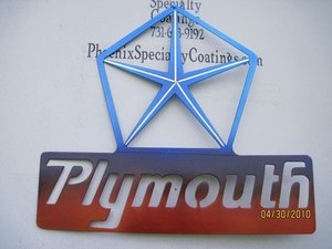
Very first try at this ... whaddya think?

-

CudaChick1968

Leanna ~ The Mistress of Metal
FABO Vendor
Joined
Jan 17, 2005
Messages
11,204
Reaction score
4,756
Location
Greenfield, Tennessee
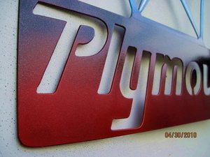
Nobody in the powder world does a color fade it seems. I've been dying to try it for a long time, so I attacked my personal Plymouth sign that RPM sold awhile back with four candy translucent powders over a base of Super Chrome.

Due to crappy overcast weather yesterday, the pictures aren't that great color-wise. The second one is probably the most accurate -- the purple is close but still no real justice -- and you still can't really see all the metal flake.

Opinions? Please be honest. If the technique isn't worth pursuing and improving on, I'd like to know ahead of time. I think it's kinda cool but my opinion doesn't really count -- yours does. :-D

View attachment 148442

View attachment 148443

Please excuse my messy shop. I wanted an inside photo too.

View attachment 148444

If offering an opinion either way (if ya think it's ugly say so! I can take it lol), please also share how much you might be willing to pay for a job like that. I love doing one offs like this but really have no clue what a reasonable price would be on a custom wall hanging -- will it be worth all the work?

Hey, Jerry Garcia got $300 for a freakin tie. :-D

Thanks for your time and for looking!
 
Red to Purple is a tuff fade. It's OK but you do need to work on it. The purple to Blue is ubrupt.
Try Red to Yellow.
 
I'm with Rumble on the colors.I think it's a good idea but the wrong colors.

Ya better start shaving your arms.:toothy10:
 
If nobody else is doing it then you are miles ahead and they wont be too far behind for long. Be the first to perfect it, maybe practice on a flame job since somebody mentioned trying red to yellow?
 
like the idea, needs more transition between the colors. value? well thats in the eye of the beholder. it is art. good luck perfecting it. keep us updated.
 
I like it! No idea on the price. How much extra time did it take to do it? You might find out why no one is doing it...
What extra did you do with the star to get the white vein in it?
C
 
I like the concept but gotta agree with Rumble that the blue>purple fade is too abrupt. I betcha more practice with it will make the technique better.
As far as price - tie it to the time it takes. Less masking, but more time involved in color change and associated gun change/clean.
 
I like the concept. I'll agree with those who said the fade is a bit abrupt, but that will come with practice.

Just curious as to why those in the industry don't really try this. Matter of the extra time? Or trying to play it safe, as in hard to mess up just one color?
 
Good job Leanna; I think it looks great. Congratulations on getting ahead of your competition.

I haven't been a member here that long, but I have seen many pics of your work over the last couple years. You never fail to impress me.
 
You're miles ahead of the competition girl for even asking opinions. Those capable of taking and useing constuctive criticism are far ahead of those that can't and don't. Probably not what you ask for but i'll tell ya what i see with my one and only "Trained" eye. The lines on the star could use a little more definition and be a little more crisp where the lines end and come together. Seems to be a surface flaw on the lower right corner of the star. I'd say blending on a smaller surface will be more difficult....for anyone. A larger format i would think would allow for the ability to achive a better/larger transition area from one color to the next. Smaller areas seem to get too busy too quick. Now keep this in mind as i'm sure you already have. Being custom, no two will be the same so yep, they could be considered a "One Off". As far as price? Custom is one price. Experiments is one price. Practice pieces is another price. With that said one is lucky if they can calculate price of labor involved/materials/consumables/burden and apply that amount to the finished product, especially on a practice piece. Sounds like you're on the cutting edge of a new concept that might turn into a lucrative skill or product so it does take some R&D. Not many folks want to pay for someone elses R&D so if you have the time/money to devote to it without compensation until you have the bugs worked out to your satifaction and those of the end user, carry on. "Practice makes perfect". Are we still friends?
Small Block
 
Great I have to follow SB's reply, hope he hasnt pi$$ed u off....Just kidding. I was thinking like he was. When people use paint schemes that blend or transition it is usually on a bigger piece of material to give them an easier or smoother transition. Thats why I think most people have said the colors are too abrupt. Someone that has an entire car or front clip they are doing, there is a much bigger surface area to blend, so mucho easier. Here is an idea why not do a poll on here for colors see what the majority says. I know next to nothing about this, so I dont know how many colors you would use. 3 or 4?? Kudos to you for taking the initiative with this. There is definitely a market for this....imo a huge market, but once you have put it out there, there is no doubt that everyone will follow, but that makes you the leader right?? I am picturing in my head a set of valve covers that have a gentle fade to them, that would be cool!! As far as price goes, that sign I would think that $100-$150 range... Ok so I hope my .02 didnt upset ya!! Good luck I like it!
 
Wow, when I asked for opinions I wasn't expecting so many great, substantive replies.

I guess I should've explained my layout a little better at the beginning. The upper Pentastar portion of the sign wasn't intended to really fade into the lower portion so much as it was just a minor transition without a sharp masking line defining the blue Pentastar.

Does that make sense? [reading] Oh hell no. Sounds like one of those Neo-blah-blah-blah art critics. LOL I need more coffee.

Ummmmmm, okay lemme try it this way: I wanted the star to stand out since it's the main focus of the sign, but I wanted to soften the edge between the blue star and the PLYMOUTH portion of the sign. Look again at that first picture.

Where the bottom edge of the Pentastar form ends and the top edge of the PLYMOUTH part begins, they don't match up size-wise (the outer edges of the Pentastar are 1/8" wide but the bottom part is closer to a 1/2") and those two curves where the star and sign meet looked really goofy with a sharp tape line right there. There was no balanced way to make it all look even.

So I see where ya'll are coming from on the abrupt blue ending, but that wasn't really what I was trying to fade. :-D Points are all extremely well taken, thank you.

Unlike wet paint techniques, powders are often done with lighter/heavier applications rather than outright color changes. The purple wasn't a powder I used -- I don't even have any purple powder on hand. It was created where the blue met the red, and as the blue was applied layer by layer it got darker and darker.

Small Block, you're very right about the crappy masking lines on my Super Chrome pin stripes. Truth be told, I had to re-apply the tape again when my blue Pentastar didn't turn out blue enough and needed more coats, and that second application got a little sloppy when I pulled the tape. You can't see the rough edges from a few feet but from a 14" camera view it shows up like a sore thumb. :-D I've never been one to try to hide anything from you guys and I'm not gonna start today.

Cal, the pinstripes are actually the very first coat on the sign, Super Chrome. I used my high temp tape to protect its integrity while working on the rest of the sign.

Randy, it's funny you'd mention trying flames. I've been dying to do that for a long time too, so don't be surprised if you see an attempt at that soon.

I know you are giving me exactly what I need to hear. Except you DRENO -- wth is up with that shaving my arms thing???? LMAO

Thank you all for taking the time to help and offer your opinions and suggestions. This is exactly how new stuff happens!!!
 
I like the concept. I'll agree with those who said the fade is a bit abrupt, but that will come with practice.

Just curious as to why those in the industry don't really try this. Matter of the extra time? Or trying to play it safe, as in hard to mess up just one color?


Robert, most of them are lucky to get one color right. :-D
 
I,m waiting to see some flame try-outs.I think flames fading into the black on my M/T valve coves would have been the cats meow!LOL(picturing in my head)I think it would,ve helped with my old skool look.:happy10:Hope you can get it pinned down,your always thinking of new ways to keep us customers happy!Good luck!8)
 
I like the idea....but as said before I would try a more gradual fade and with different colors.

I think maybe if you started with metallic red,orange and yellow and did a gradual fade and then went over the top of it with a translucent pale orange or something (to tie the blend in even more so) that it would come out looking sharp.

your abilities are only limited by your imagination Leanna and I am sure you can pull off some neat stuff that noone else is dabbling in either way! Good luck!!!
 
I like the concept, Leanna.

I think that it may look better if you were to take the pictures with a solid background. It's kinda hard to really see the definition between the colours when the background takes away from them.

Keep up the good work, you continue to amaze us with your skills. And your powder coating, too. :-D
 
If it said "Dodge", I wouldn't hesitate to hang that in my shop. I love the colours, and I think you did a fantastic job!
 
Most of my observations have already been taken, but one I didn't see anyone mention of was the darker color over the word "Plymouth" isn't even over the "Pl" portions of the sign. I like symmetry and if that was done it would look a little better.

As far as price goes. I'm not overly versed at what it would cost to powder coat that sign in the first place, but would expect maybe a 20-30% higher premium than what a single color would cost. If you could charge that much more and make a profit while justifying the amount of labor and materials utilized I believe you'd make more than trying to get 200% or more than what a single color would cost.
 
Scott, after reading PMs I'm happy to report I've been contracted to try flames on one of the Mopar "M" signs for motopsycho, so if it's lame we'll all be the first to know. LOL I appreciate your confidence Eddie ... just hope I can pull it off.

Thanks DD72! No need to try to a powder orange in there since mxing yellow and red will create the orange. Besides, orange candy powders look more like ugly burnt root beer rather than orange. I've tried a few and hated them all.

Mox, you're very right about the busy background. If you've looked at my website Gallery, you already know I take "formal" pictures with as much solid background as possible so as to concentrate on the work. The three above and the dozen or so others of the sign I didn't have room to post were just some informal quickies out in the yard trying (and failing) to capture the metallics.

bkbond, I can tell you're an artist too. I noticed it's light from the left edge all the way to the leftmost portion of the Y. I also had some trouble with the O and H. It's due to a phenomenon in the powder world called the Faraday Cage Effect ... I can take ya to school if you really want to know LOL, but without a big technical explanation it basically happens near breaks in the surface or corners where other nearby metal repels powder adhesion.

Here's a couple more pics of it hanging on my shop walk in door. The big line in the blue/purple really doesn't show up that much in person and I have no idea why it did in this picture. The other accents the lightness on the P and L. The other variations in the lower red area were from spraying the letters from the back side with Gold Sparkle to give them some highlight. I sure didn't expect it to turn Wilder Red into candy apple though -- that was a surprise.

IMG_0938.jpg

IMG_0939.jpg

Live, learn and practice. Keep the observations coming! They're all very helpful and give me incentive to get better at this.

IMG_0938.jpg


IMG_0939.jpg
 
I like it. if you do a mopar one and do the star in the blue then go from that sassy green to yellow..I would buy one..:cheers::cheers: Artie
 
-
Back
Top